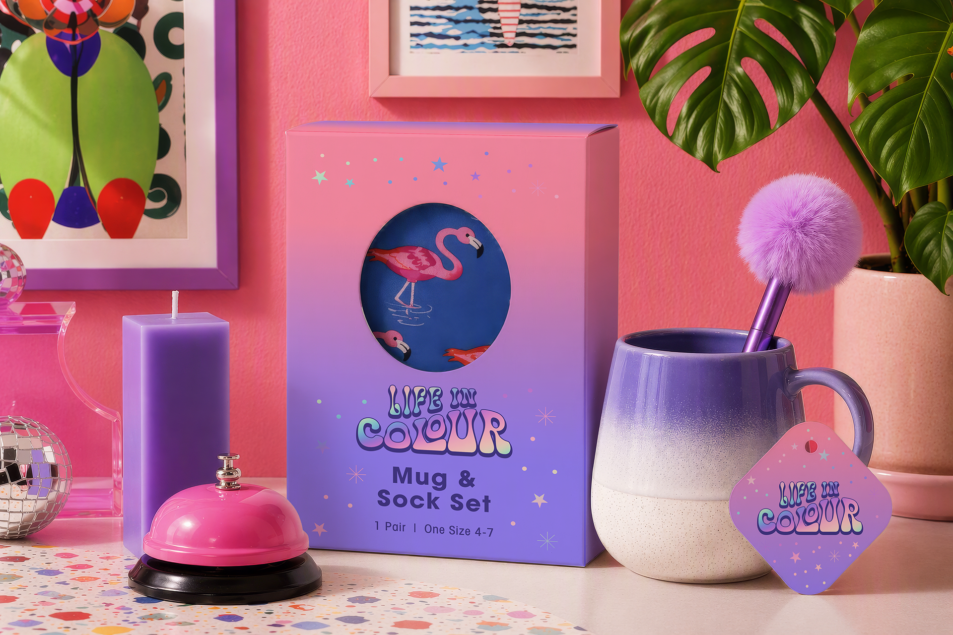
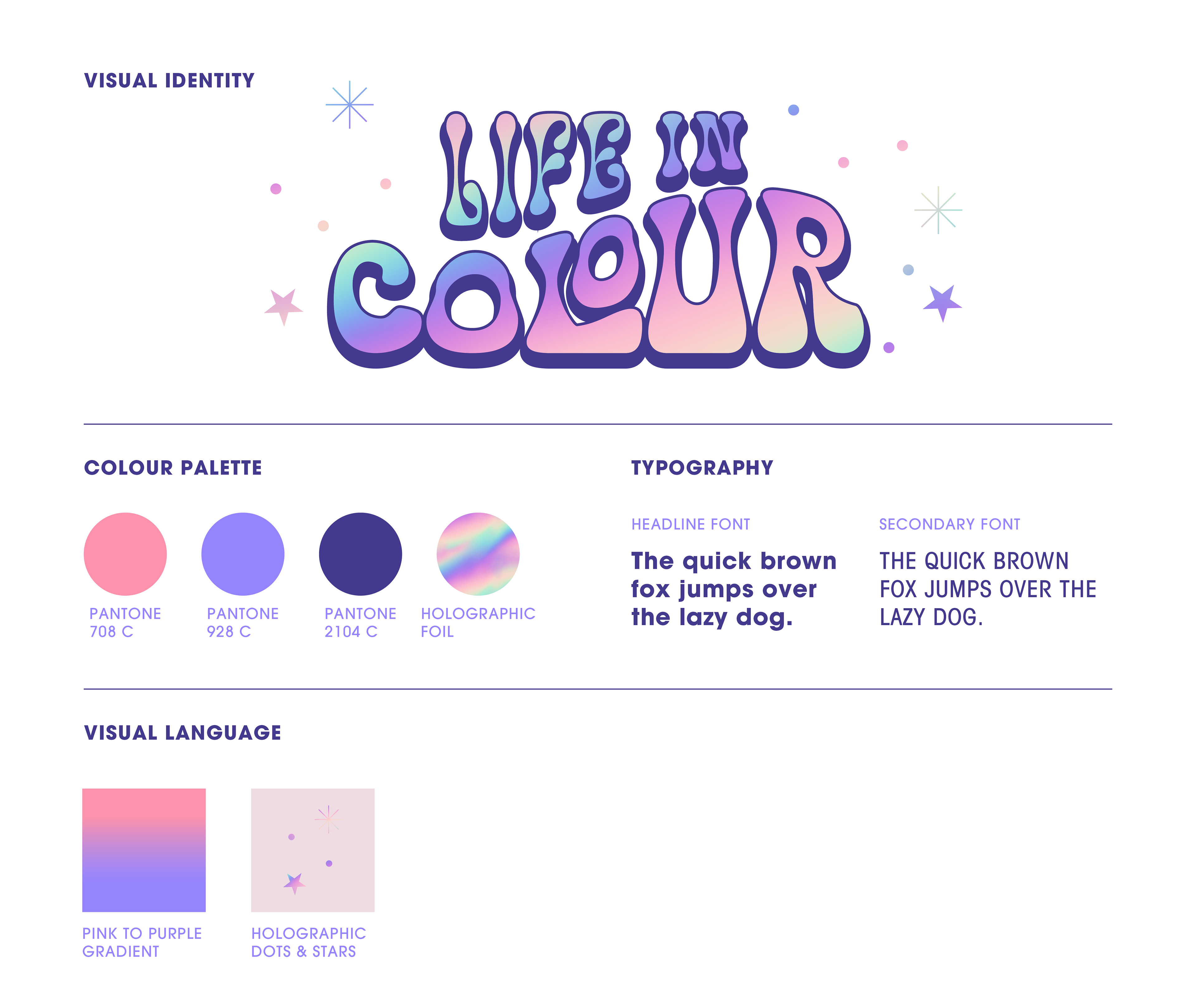
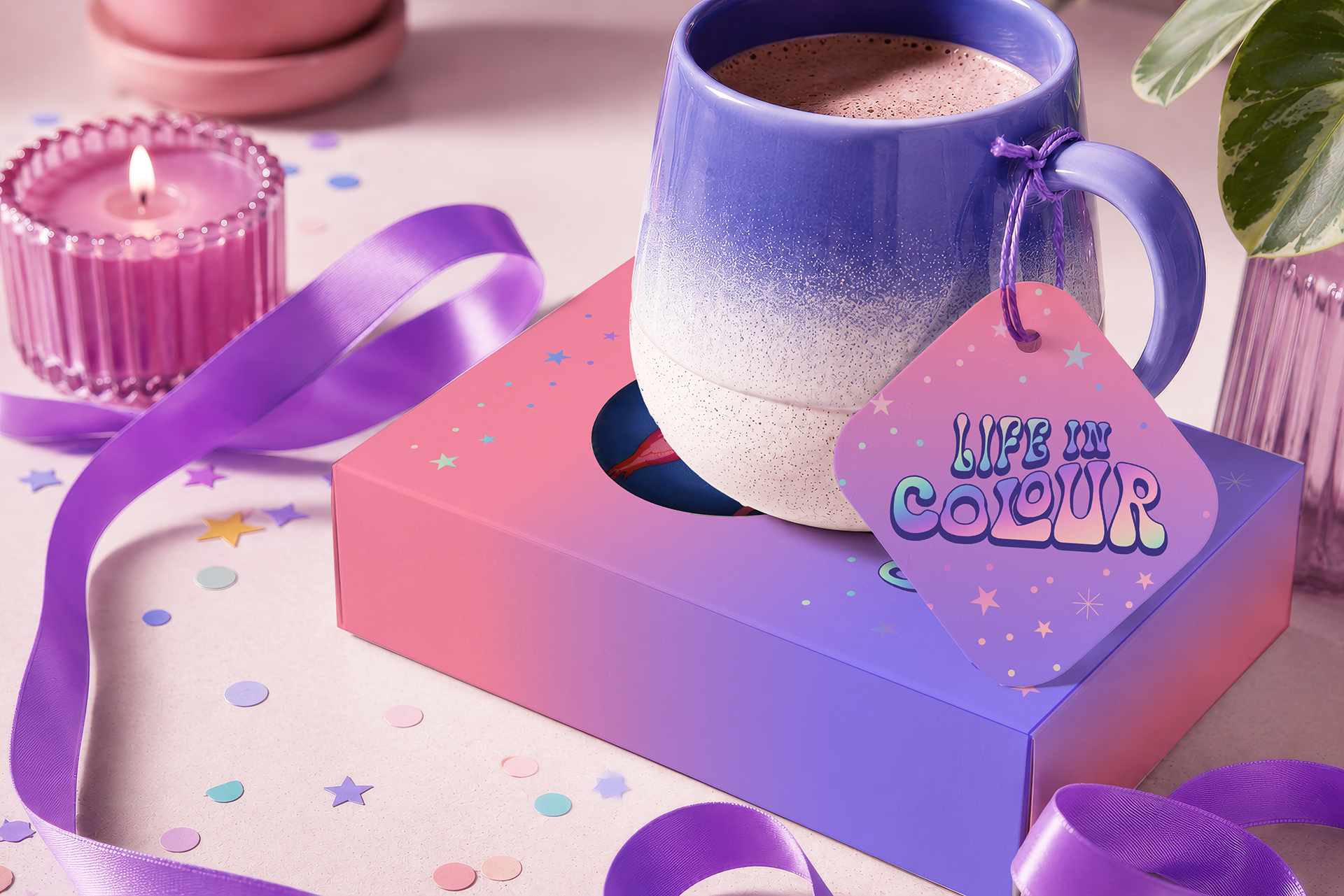
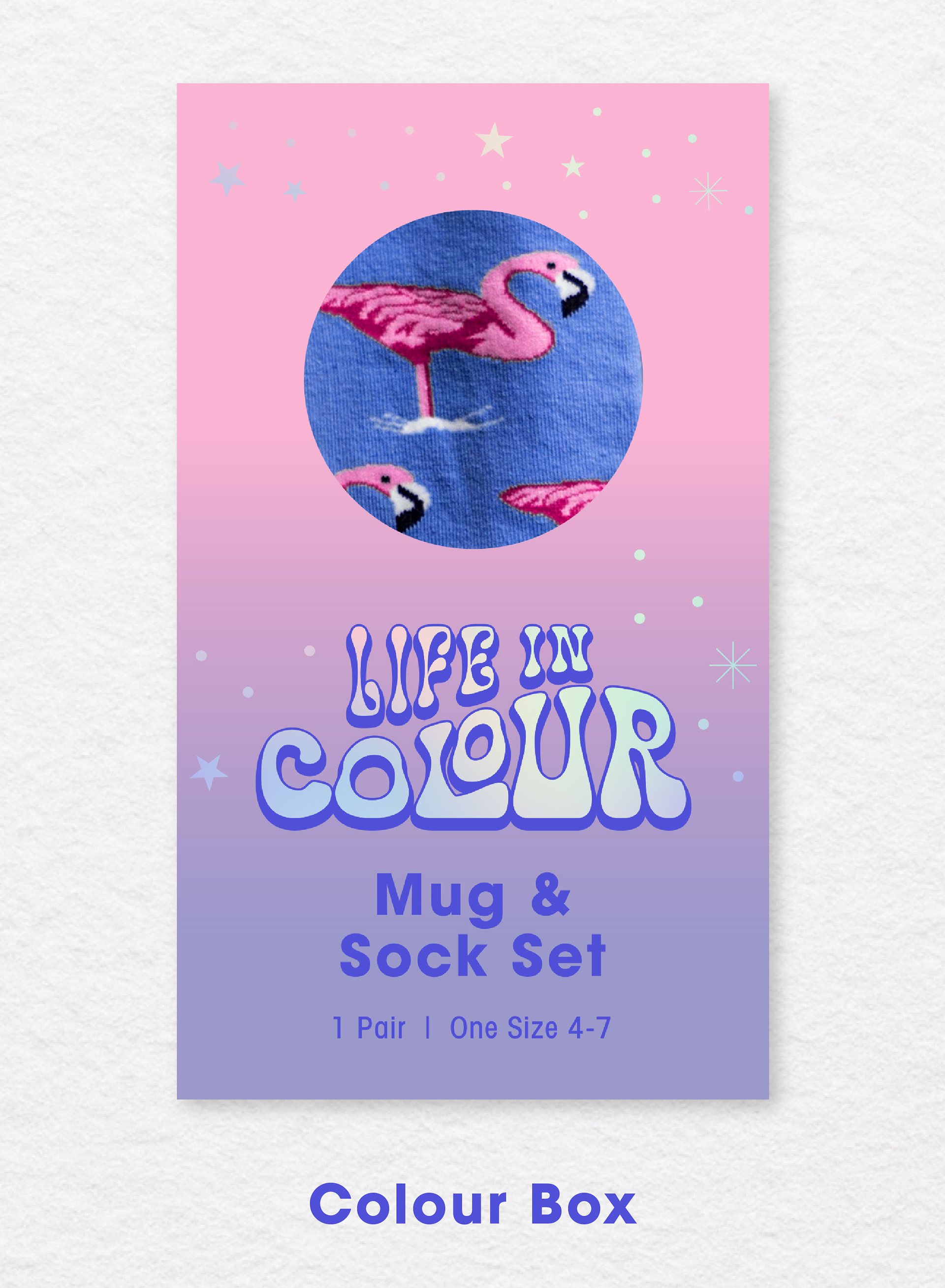
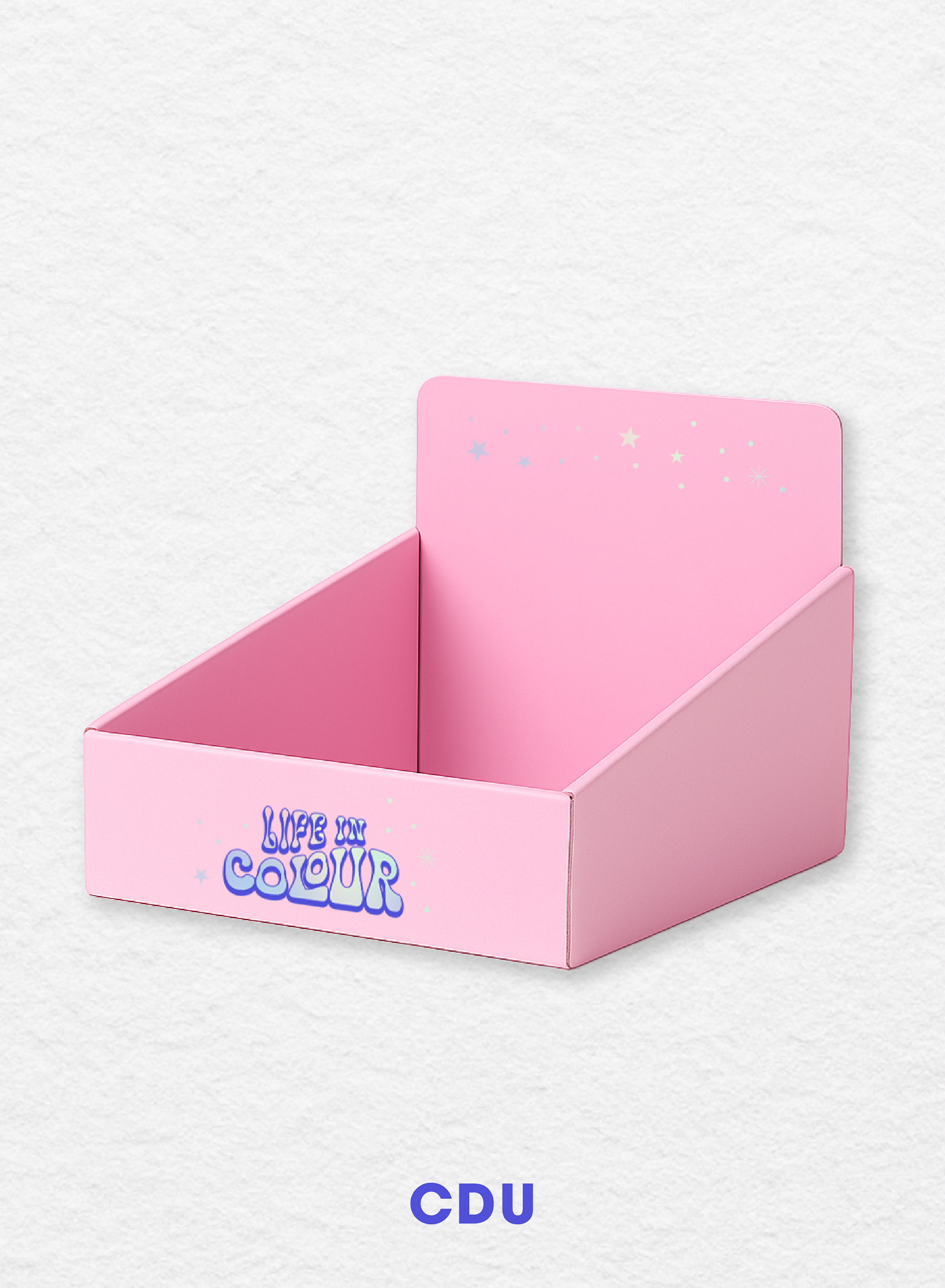
Concept & Inspiration
The visual direction for Life in Colour was inspired by retro aesthetics, dreamy pastels, and 70s-style typography. I curated a mood board filled with playful design cues: bubbly logotypes, wavy candle forms, and glossy, disco textures. The goal was to create a product range that felt bright, fun, and spirited, appealing to shoppers looking for quirky and nostalgic gifts.
I wanted every element, from the packaging to the tags, to feel joyful and collectible, with a colour palette that transitions from candy pinks to periwinkle purples, evoking a soft, surreal vibrance.

Packaging Assets & Mockups


Reflection
Life in Colour was a particularly rewarding project that allowed me to fully lean into bold, characterful design. This collection was an opportunity to merge playful branding with product packaging, creating an immersive and cohesive retail experience.
While the designs were originally developed in a softer pastel palette, reworking the visuals in richer hues allowed me to push the vibrancy and impact further, resulting in a more energetic and eye-catching presentation that feels true to my current style.
The project reinforced the importance of adaptability in visual storytelling, especially when translating concepts across physical products and in-store displays.