
Concept & Inspiration
Mason & Jones Solar was designed to bring a sense of warmth, style, and seasonal delight to outdoor living. Inspired by the bright optimism of long summer evenings, the brand combines classic garden motifs with bold, contemporary packaging. The palette blends sun-washed hues with deep navy for contrast and shelf standout, while elegant serif typography reflects a trusted, quality-driven voice. The goal was to create a look that feels both accessible and aspirational - a range customers would be proud to display in their gardens.

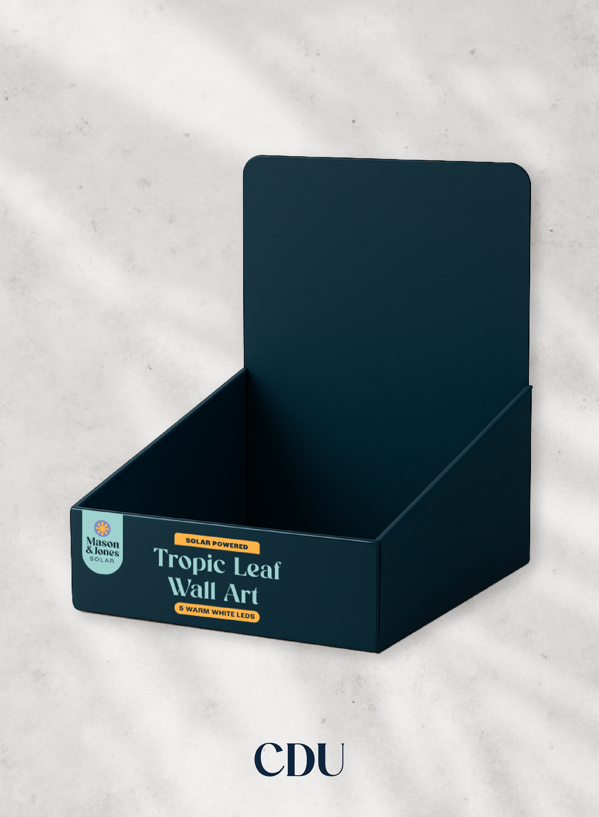
Packaging Assets & Mockups


Reflection
Mason & Jones was a fulfilling project that allowed me to bring together brand storytelling, packaging design, and lifestyle imagery to build a cohesive and visually appealing identity for a national retail range. The challenge was to create a solar brand that felt ownable, trustworthy, and bright, without leaning too far into predictable or overly technical cues.
I focused on balancing a contemporary aesthetic with a warm, garden-inspired tone, using a considered palette, editorial typography, and practical packaging formats. The result is a brand that feels both elevated and accessible, suited to its place on-shelf at B&M.
This project reaffirmed how effective a strong visual system can be across varied formats and how important it is to consider both customer impact and commercial viability when designing for retail.